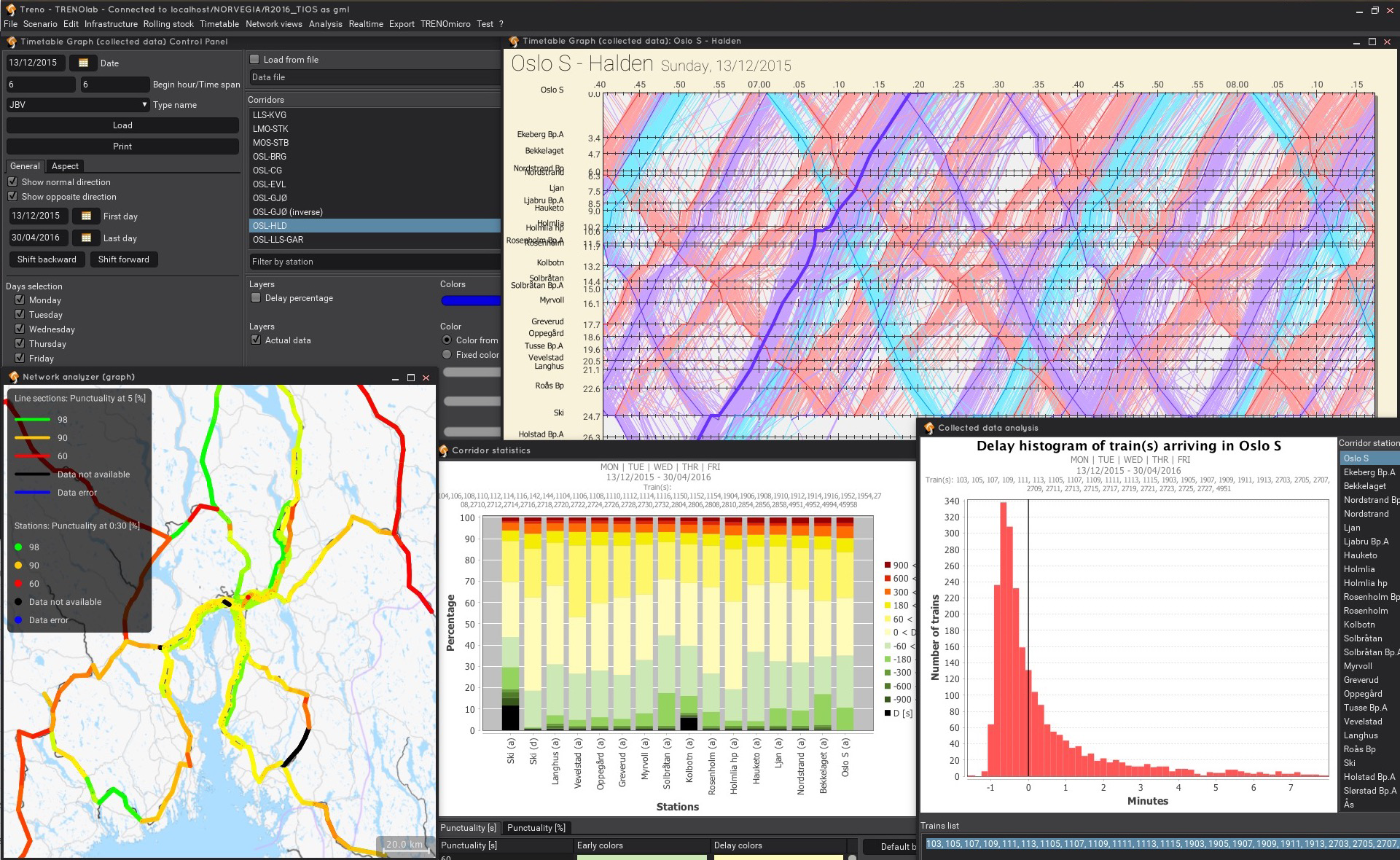
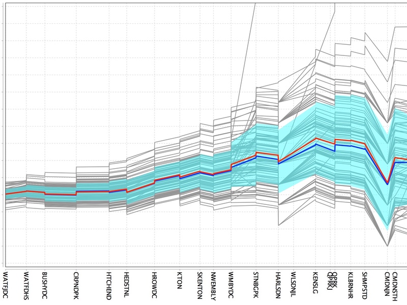
The train diagram or graphic timetable is the most common document for railway experts. Alongside the planned timetable, the tool represents the real (or simulated) traffic on each day of a selected time interval. This allows a visual, qualitative comparison of planned and actual data that supports a quick identification of delay causes. The mean delay, the standard deviation of delays and the percentage-covering area can also be added to the graph in order to quantify the variation of a specific indicator for each train along the line. Colors, lines and fonts can be customized and the diagram can easily be exported as high-resolution image or vectorial PDF.
TRENOanalysis
Explore rail traffic to maximize reliability
A customisable analysis tool to maximize railway reliability.
Understanding the processes and dynamics of real operations is a key factor for successful railway planning. Even the best planned timetables can show unsatisfactory reliability when put into operation. TRENOanalysis identifies, measures and visualizes the causes and impacts of delays or real railway traffic and thereby helps planners develop effective measures to maximise service quality.
TRENOanalysis is the only tool specifically designed to view and analyse real and simulated railway traffic data, automatically pointing out critical points and estimating reliability indicators, representing them using a wide range of diagrams and statistics at different aggregation levels.
Reasons to use TRENOanalysis
A number of diagrams
Choose among over 10 tools to visualize and export your data
Scalable
From network-wide delay maps, to the histogram of stop times at any stop, you always get the ideal level of detail
Clear
The diagrams are not only nice and customizable, but also the best way to understand and explain real-world operations
Powerful
TRENOanalysis has been successfully tested in several countries, proving robust even with the largest datasets.
Flexible
Our team is glad to implement new functions to adapt TRENOanalysis at best to your needs
Integrated
It can import operational data in a variety of formats, and includes a customisable interface to import almost any csv and text file.
Main features of TRENOanalysis
Based on a robust, powerful and reliable database, TRENOanalysis explores real and simulated railway traffic data, automatically pointing out critical points and estimating reliability indicators, representing them using a wide range of diagrams and statistics at different aggregation levels.
- Graphic Timetable
- Histograms
- Corridor view
- Network Analyzer
- Check Panel
- Scenario Comparison
- Delay evolution
- Import Interfaces
- Under the hood
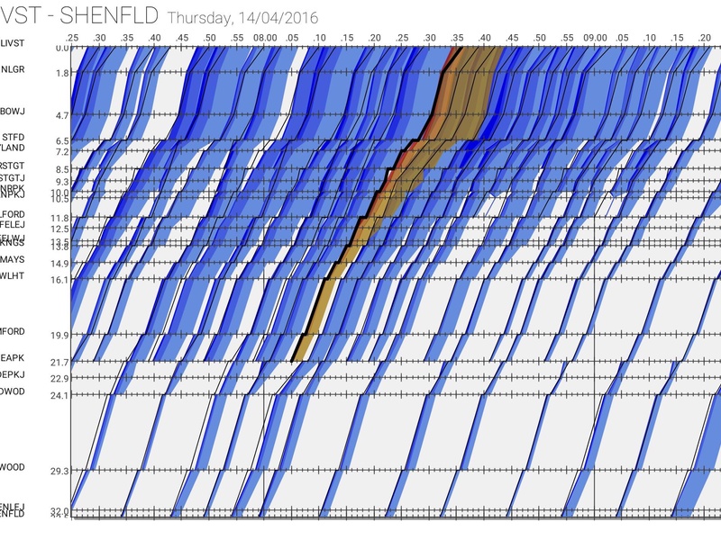
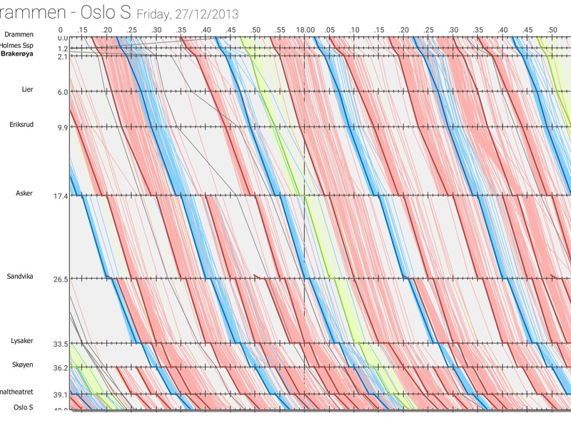
Graphic Timetable
Smart, customizable software solutions to make railway planning more effective and efficient.
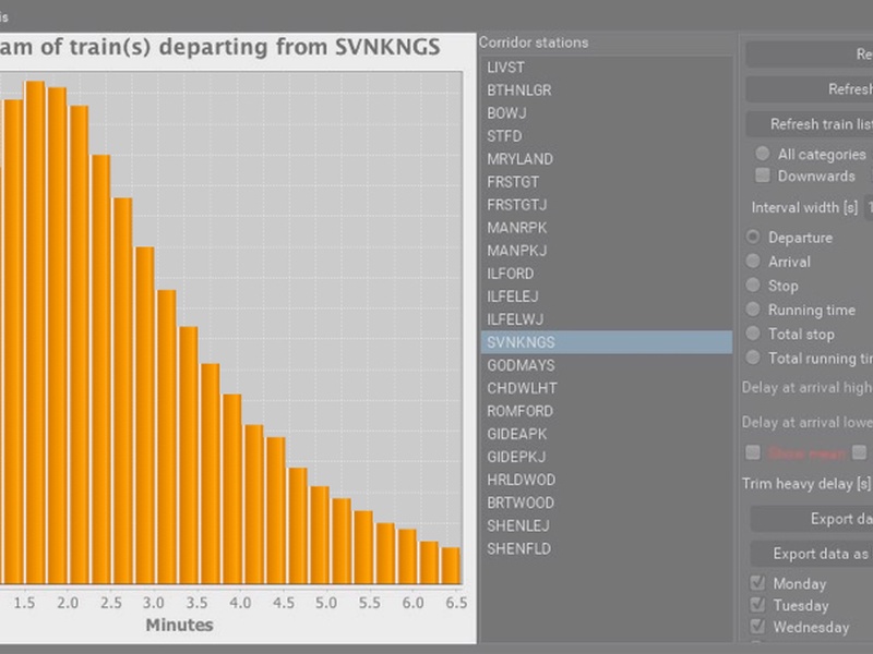
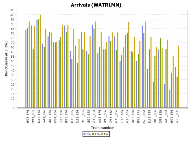
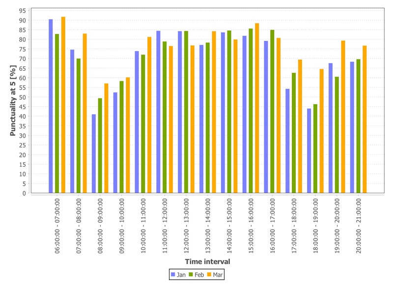
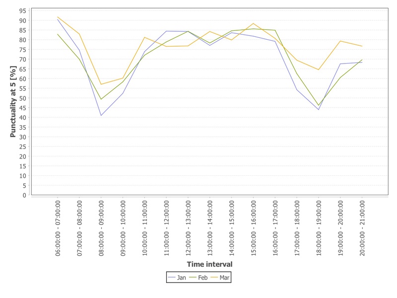
Histograms
The most detailed way to view traffic data.
When focus on a train group or a single train at a station is required, it is possible to view the process time distribution as an ordinary or cumulative histogram, representing:
- Departure delay
- Arrival delay
- Running time
- Stop time
and separating early and late-running trains or trimming the heaviest perturbations. It is also possible to chose different weekdays.
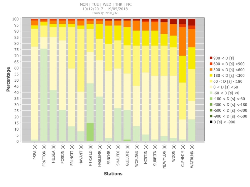
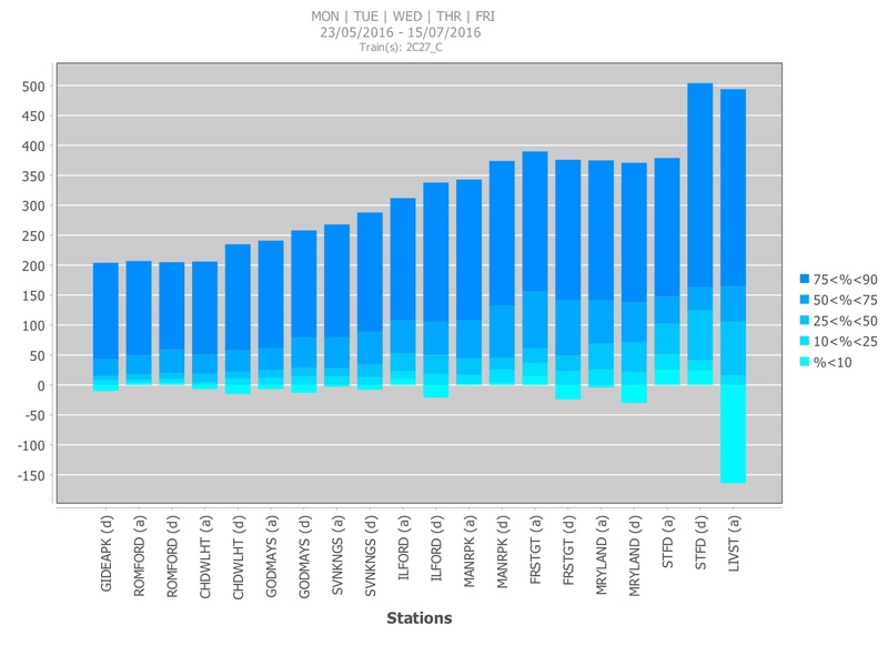
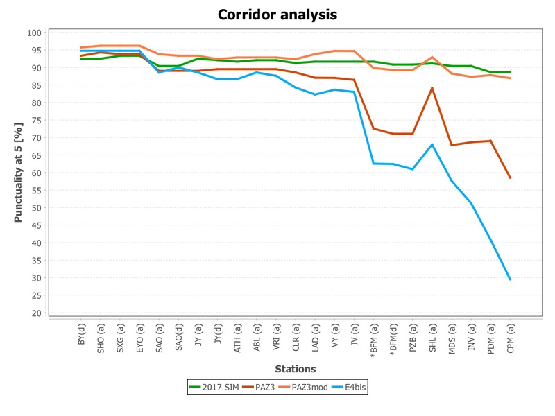
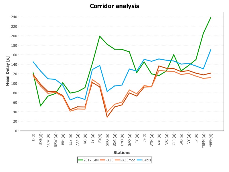
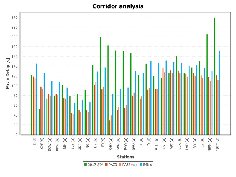
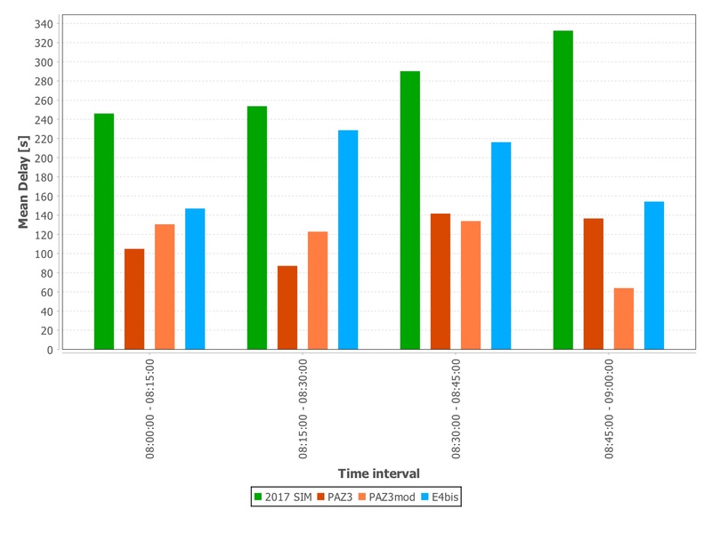
Corridor view
A smart way to quantitatively represent delay distributions along a corridor in a single diagram.
The corridor view allows a simple and intuitive representation of delay distributions over multiple timetabling points of a corridor in a single diagram. It is possible to select:
Corridor view using delay thresholds
Each histogram represents the distribution (arrival, departure or stop time) at one station and is divided into colors indicating the percentage of trains within given delay thresholds. Considering the lightest part, the upper bands indicate higher delays, and the lower early running trains. The lightest yellow part indicates trains between 0 and +60 seconds delay; the upper band next to this contains the trains between +60 and +180 seconds delay, then between 180 and 300) and so on. Symmetrically, the bands under the lightest one respectively indicate early-running trains between 0 and -60, -60 and -180 seconds, etc… using a green color graduation.
Corridor view using percentiles
Each histogram represents the distribution (arrival, departure or stop time) at one station and is divided into colors indicating the delay of the nth percentile of the distribution. Considering the lightest part, the border with the darker one indicates the first percentile, etc… for a number of color intervals corresponding to the percentiles defined by the user.
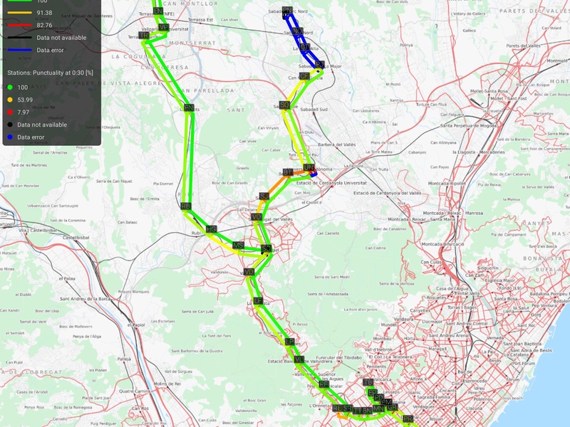
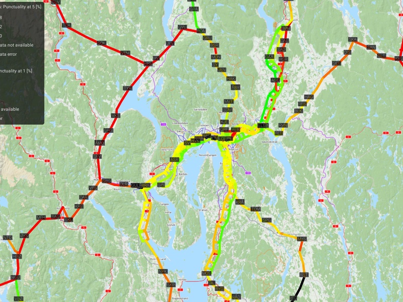
Network Analyzer
Time is money and finding critical points quickly even on large networks is phenomenal.
Quick identification of major reliability problems is possible when planners can find critical points in the network without opening each individual corridor. The “check panel” points out stations and line sections where significant perturbations occur. These are shown on a list with relevant parameters on a colored background that improves legibility. Depending on the research focus (arrivals, departures, stop and running times) a number of predefined reliability parameters can be chosen and coupled with user-defined thresholds. The entire table or a part of it can be exported using copy & paste to Excel or OpenOffice.org.
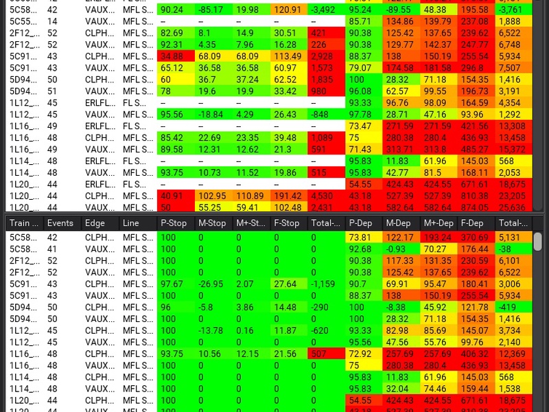
Check Panel
Time is money. And finding acritical points quickly even on large networks is phenomenal.
A delay analysis at network level offers easy detection of the stations or sections where perturbations occur, considering interdependencies among lines and nodes. The Network Analyzer offers a zoomable network view representing delays per direction on each section and station. Various filtering criteria and reliability parameters can be depicted, including mean delay and punctuality at different thresholds. Color intervals are user defined or defined automatically to quickly point out critical edges and nodes, while Google Maps or OpenStreetMap can be chosen as background.
Scenario Comparison
An efficient way to compare multiple real and/or simulated scenarios.
While performing simulation studies, it is often necessary to compare the performances of different scenarios. With scenario comparison it is possible to compare the traffic data among alternative real and simulated scenarios (with different timetables, weekdays, months) at one station for a number of trains or for a group of trains along a corridor. It is also possible to visualize and compare the evolution of delays during the day.
Delay evolution
How do the best, worst and average trains behave along a line?
The delay evolution diagram allows viewing the evolution of delays of single train runs along a corridor, also showing their mean, median and standard deviation.
Flexibility adaptable to your needs
Import data in standard or custom formats simply, reliably.
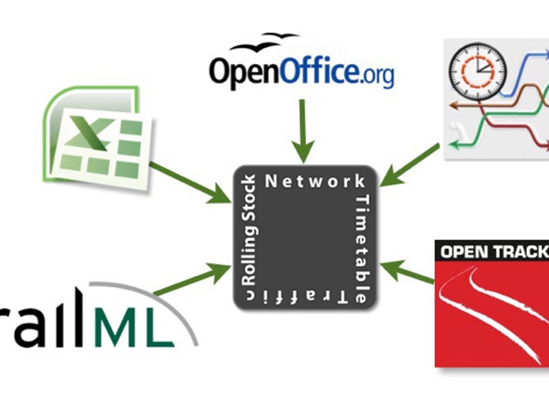
TRENO’s modular architecture, and trenolab’s flexible and responsive approach are the key characteristics that make TRENOanalysis extremely adaptable to the requirements of users. Additional diagrams and statistics are added on-demand, allowing different views of data or the automatic generation of punctuality reports. For example, for metro systems, specific statistics measure the headway time between trains to verify the effective service frequency offered to passengers. Similarly, TRENO features a number of interfaces to import planned and real timetable data for over 15 operators from 10 Countries. Among these, TRENO supports railML, the international standard for timetable data, in both its basic version 1.0 and in the newest 2.2. Additional interfaces to import data in any format are easily and conveniently added to the tool in a few days, making it perfectly integrable in your IT systems.
Under the hood
Strong foundation and interoperability.
TRENOanalysis is a java application based on a powerful and reliable PostgreSQL DBMS. It can be used on Windows, Mac or Linux OS. TRENOanalysis stores planned, real-world collected data and simulation outputs in different scenarios. A simple infrastructure model represents the network.
System Requirements
- Any standard PC (running Windows, Mac OS or Linux), with at least 2GB RAM Memory,
- At least 4GB free Hard-disk space (depending on the amount of data to be stored).
- High resolution monitor (at least 1366×768, full HD suggested; the tool also supports multiple monitors).
- Oracle Java JRE 8, PostgreSQL 9.5
License Key
TRENOanalysis features a USB hardware key. The software can be installed on multiple computers, and the USB dongle must be plugged in locally to use the software.